Magazine spread
Brief Create a magazine spread for a print magazine. Use your own photographs from previous projects in the course Digital photography. Feel free to crop and reprocess the photos so that they are adapted to the purpose of the publication. The content of the article, determined by your choice of headline and photos, should be reflected in your design language. At least one of the images must be a fallout.
Formulate your own heading and subheading. Lorem ipsum is used for body text and image captions.
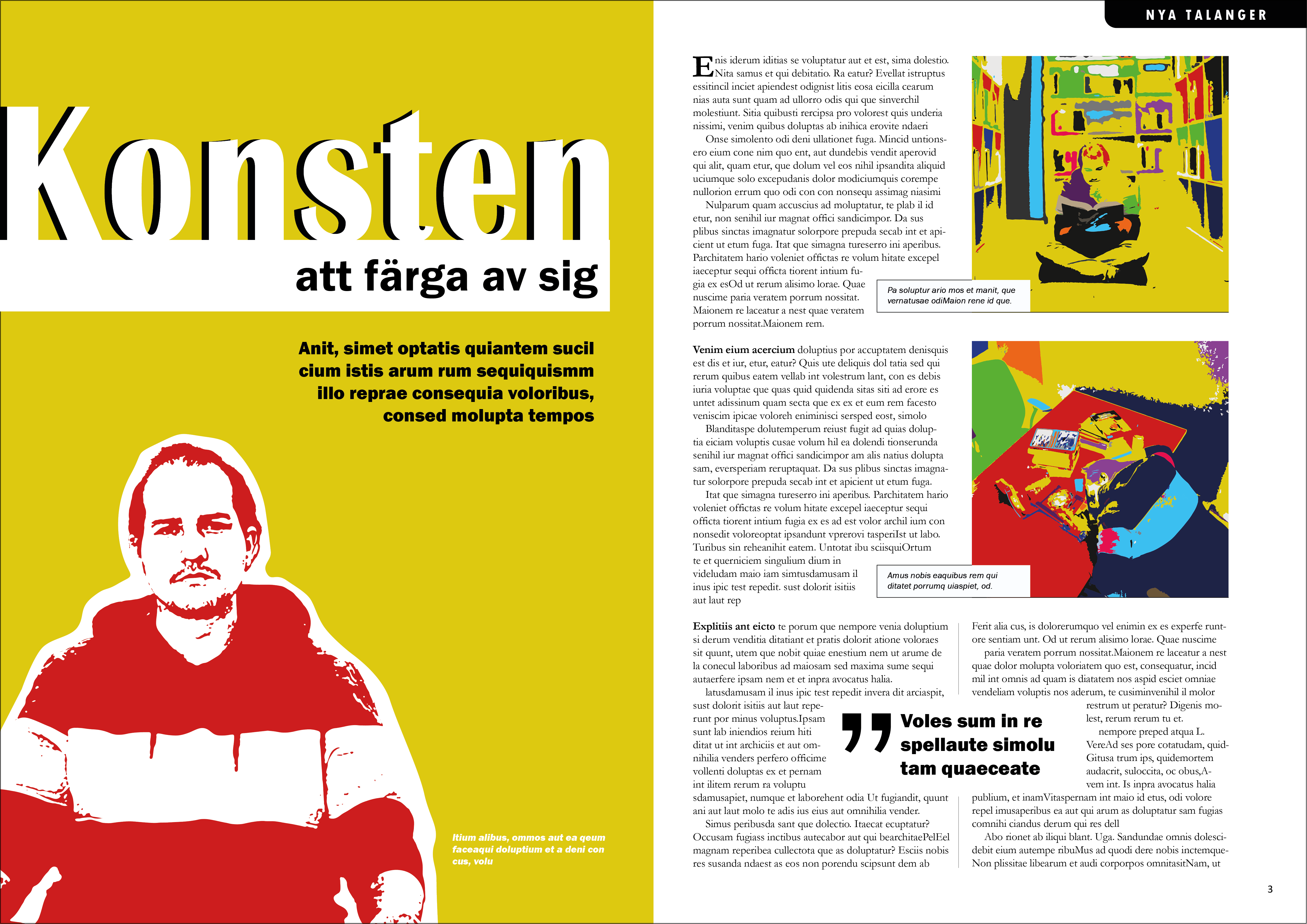
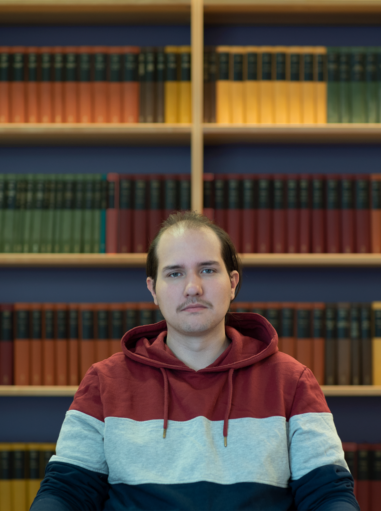
Result I challenged myself to heavily alter my original images so as not to lock my view of its original use. To create the opposite of the original images, inspiration was taken from Marilyn Monroe’s famous lithographs.
As a fictional scenario, the two smaller images are intended works of art to be published in a cultural magazine. The spread designer (me) has therefore been inspired by them in the creation of the spread. The artist portrait is thus remade to match the artwork. This is so that content and form should be in harmony, which is important to reach out with the artist’s message. I also chosen to include air in the spread and wide foot and outer margins to create a more exclusive feeling that is synonymous with a respected cultural magazine.
Four design principles have been interpreted into the spread:
- Contrast comes in different constellations such as size and the color contrast on the left and right side. Left is more conspicuous. The left page header is superior in size and color contrast to the artist portrait, which is done to guide the recipient’s orientation across the page and spread. I wanted to steer to the headline first.
- Balance is found in the asymmetric set. Even though the images on the right side do not win in contrast, they balance the spread because they get extra weight from being on the right side.
- Line refers to the invisible grid system that creates order between texts and images. This design is based on a division of thirds. The invisible guides help create a visual common thread through the white rectangles in the header, the artist’s shirt, empty column lines, the quote frame, the caption boxes, and the bottom margin.
- Rhythm in this dynamic spread is found in color, shape and size contrast that entices to read. Heading, sub-heading and quotations give a hint about the content and the beginning helps one find the start for deepening.
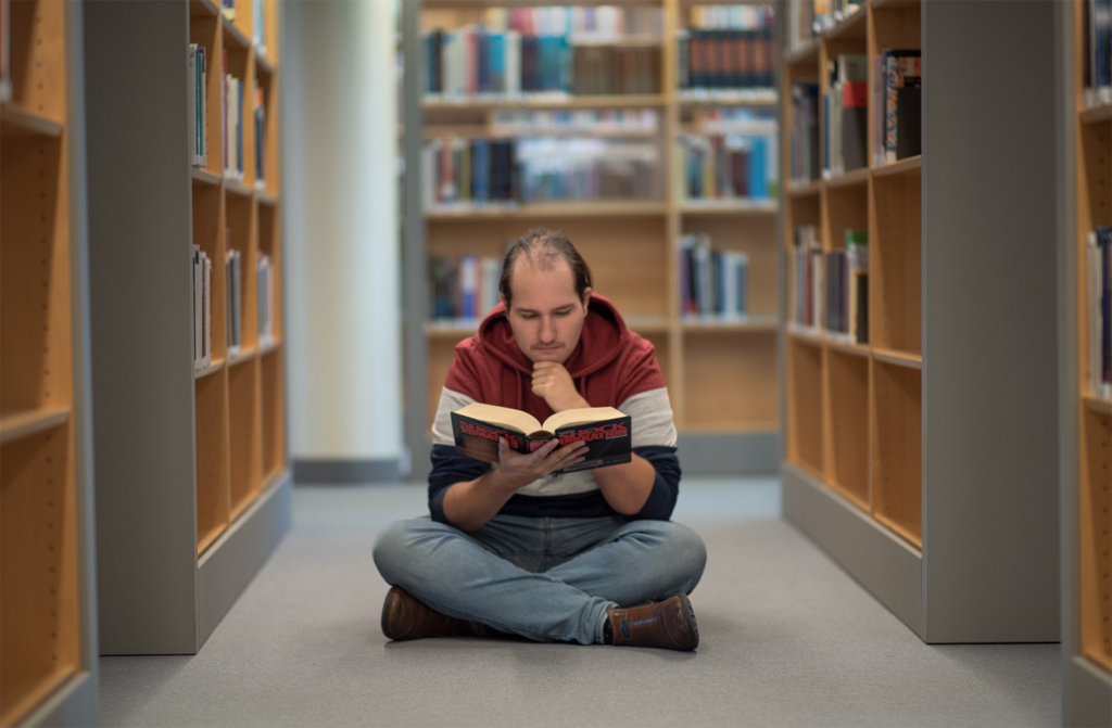
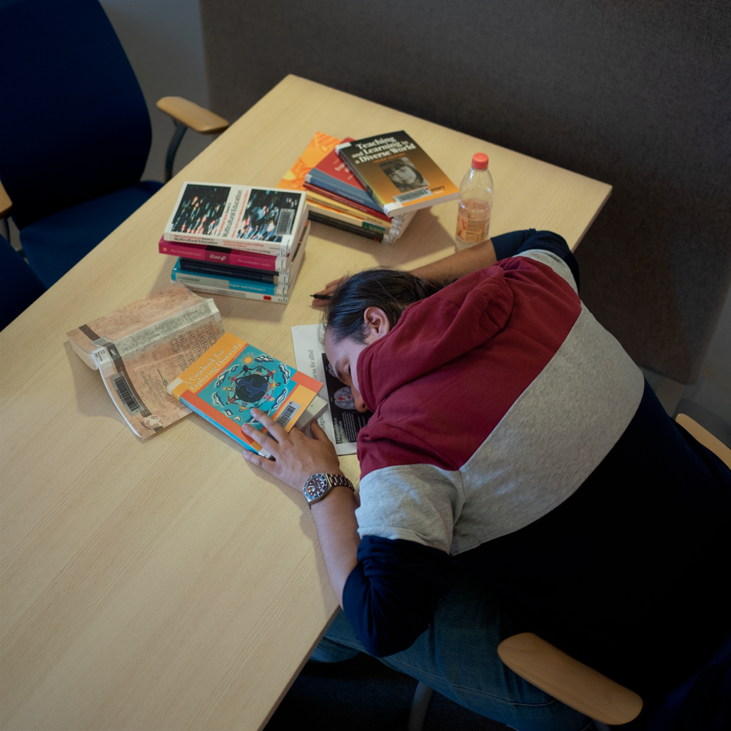
Original photos