Logotype for coffee brand
Brief Create a logo for a fictitious customer. The logo must consist of both text and graphics. A color variant and a solid color variant. Create an animated vignette for the logotype.
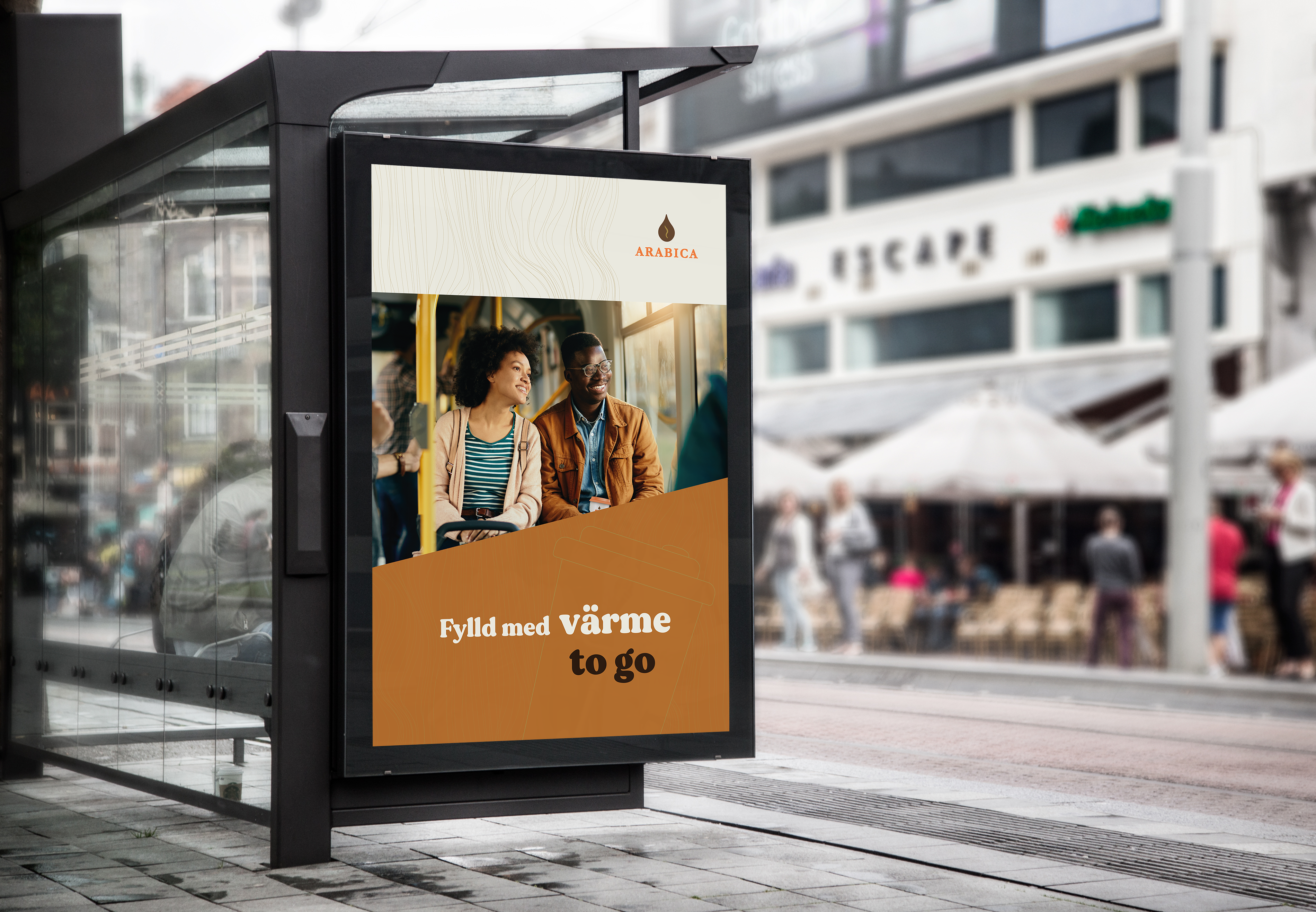
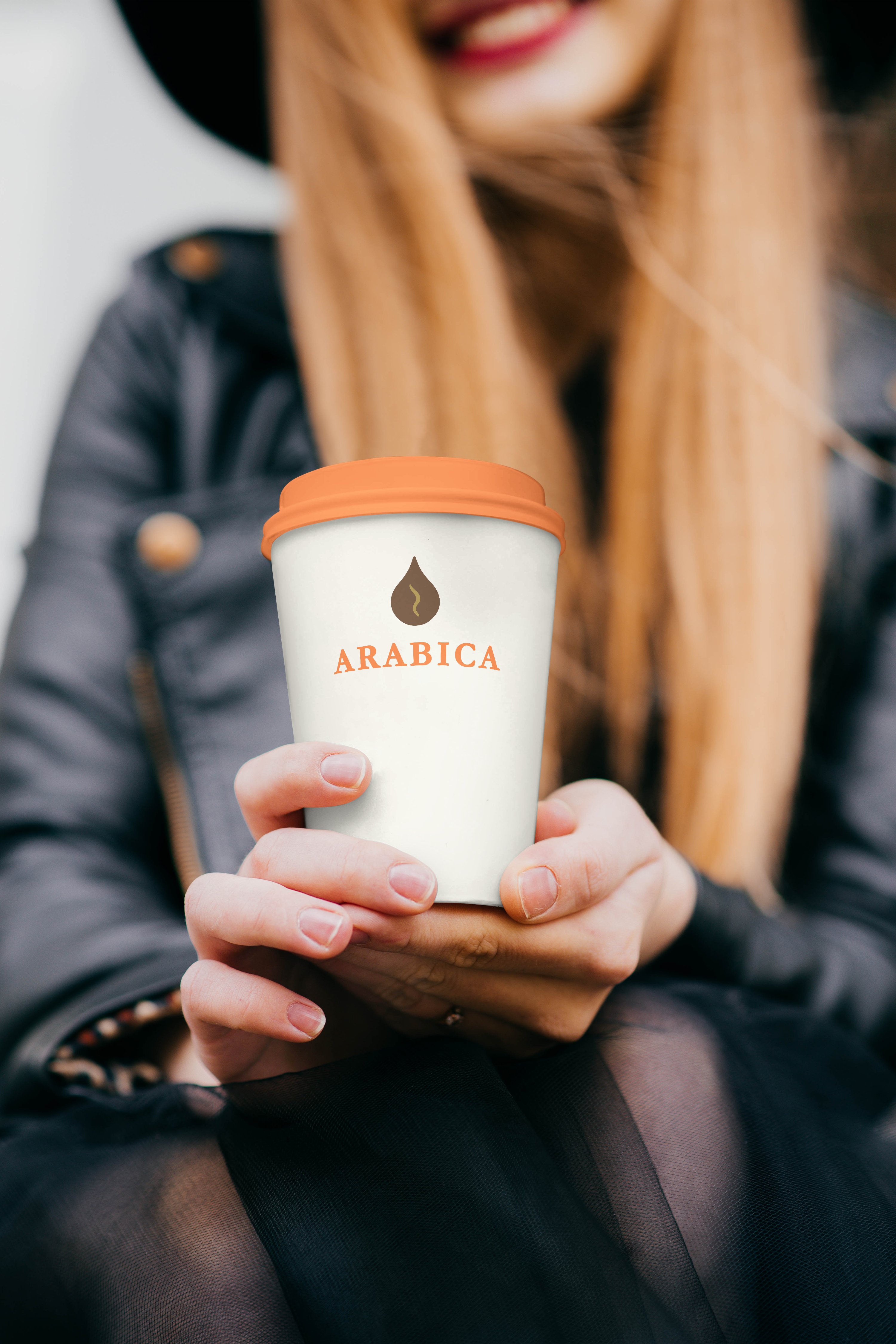
“Although the cafe industry is competitive, a new player is planning to enter the market. The new company will be called “Arabica” after the Latin name of one of the more common, but also most appreciated, coffee beans. The idea is not to offer seating and café environments to settle down in, but only to sell take-away coffee in environments such as city centres, railway central stations, airports and similar surroundings. It’s coffee for people on the go in an urban environment. In terms of price, the aim is to go relatively high, because the brand will be built so strongly that customers will happily want to be seen with an Arabica mug in their hand. The owners behind Arabica want a logo that represents a strong, luxurious brand that consumers feel okay paying a little extra for.”
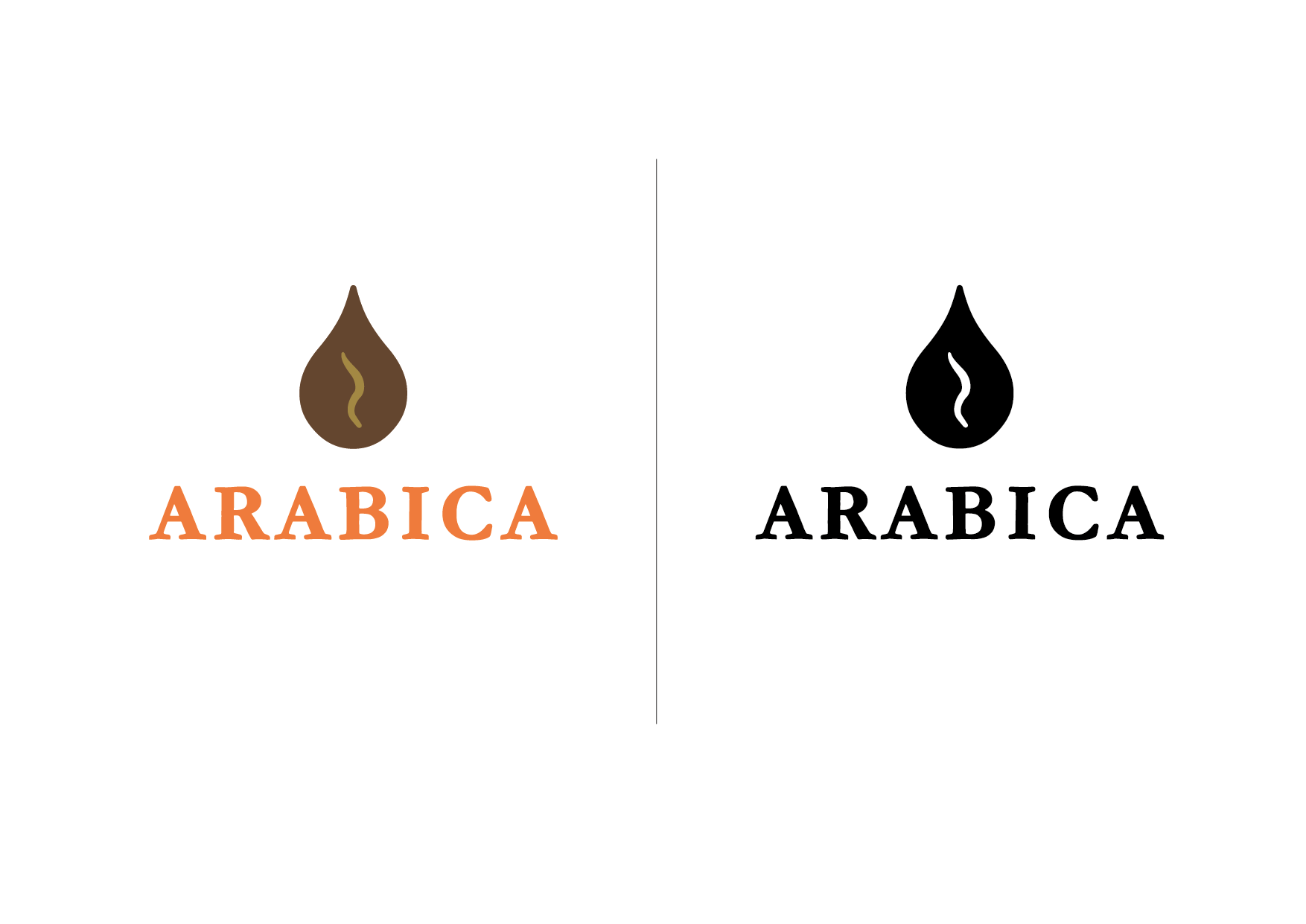
DESIGN. The composition is based on having text at the bottom and symbol at the top. Capitals were chosen to design text and symbol together into a triangle shape. A large “A” at the beginning and at the end helps to create an abstract mountain that connects to the mountain slopes on which the coffee plant is grown. Like a mountain, the capitals make the logo balanced and stand firm.
TYPOGRAPHY The typeface chosen is called Garamond and is modified by rounding the corners a little. This is to give the text and symbol a little more visual coherence. The font has serifs, which was chosen partly so that text and symbol contrast with each other. Serifs are traditional, which suits the coffee product segment, which has a rich and long history.
COLOR Orange is vibrant and suitable for caffeinated drinks. The color brings out the coffee’s properties such as warmth and energy. Arabica is a well-known coffee bean and its ripening color is red, which several competitors use, which made me deliberately opt out of that color. I also opted out of green because take-away competitors Starbucks and Espresso House have it in their logos. Orange is thus different from its competitors.
Brown is strongly associated with coffee and creates a recognition for the drink.
SHAPE The symbol can be interpreted in several ways. Mainly it is a drop, but with the wavy line you also see a coffee bean. A third way is to see the shape as a flame with a wick. The wavy line can also be seen as smoking hot. All the forms are associated with hot coffee.