Poster
Brief The environmental organization Vår Värld wants a poster to use as PR in its offices around Sweden. They work broadly with issues surrounding animals and nature, climate change and requirements for sustainability. They want the poster’s design – choice of text line and its design – to somehow reflect the business.
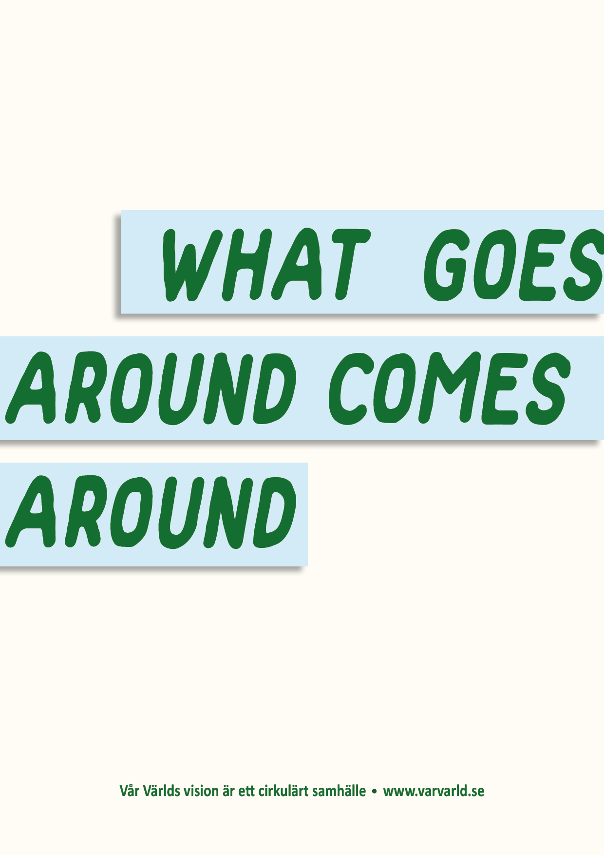
The task is to design a poster in the form of a word image ( = “appearance of a written word”), based on a proverb, quote or line of verse. Reinforce the message by using the shape of the font and color scheme.
Result A well-known proverb was used as its meaning together with the environmental organization has a resonance. A rounded font is used to allude to the word “around”. The text has been skewed to facilitate reading around the poster.
The typeface was chosen as it is subtly associated with countries with its irregular outline and it is enhanced with a grassy green shade set against a blue background that visualizes water. These colors are often associated with the earth and environment. The background color is faint beige to increase the feeling of earthy colors and give the negative (unused) surfaces more meaning.
Uppercase was chosen because lowercase would cause the letter “g” to go down into an underhang and disrupt the visual the impression.